
Notes
(04)
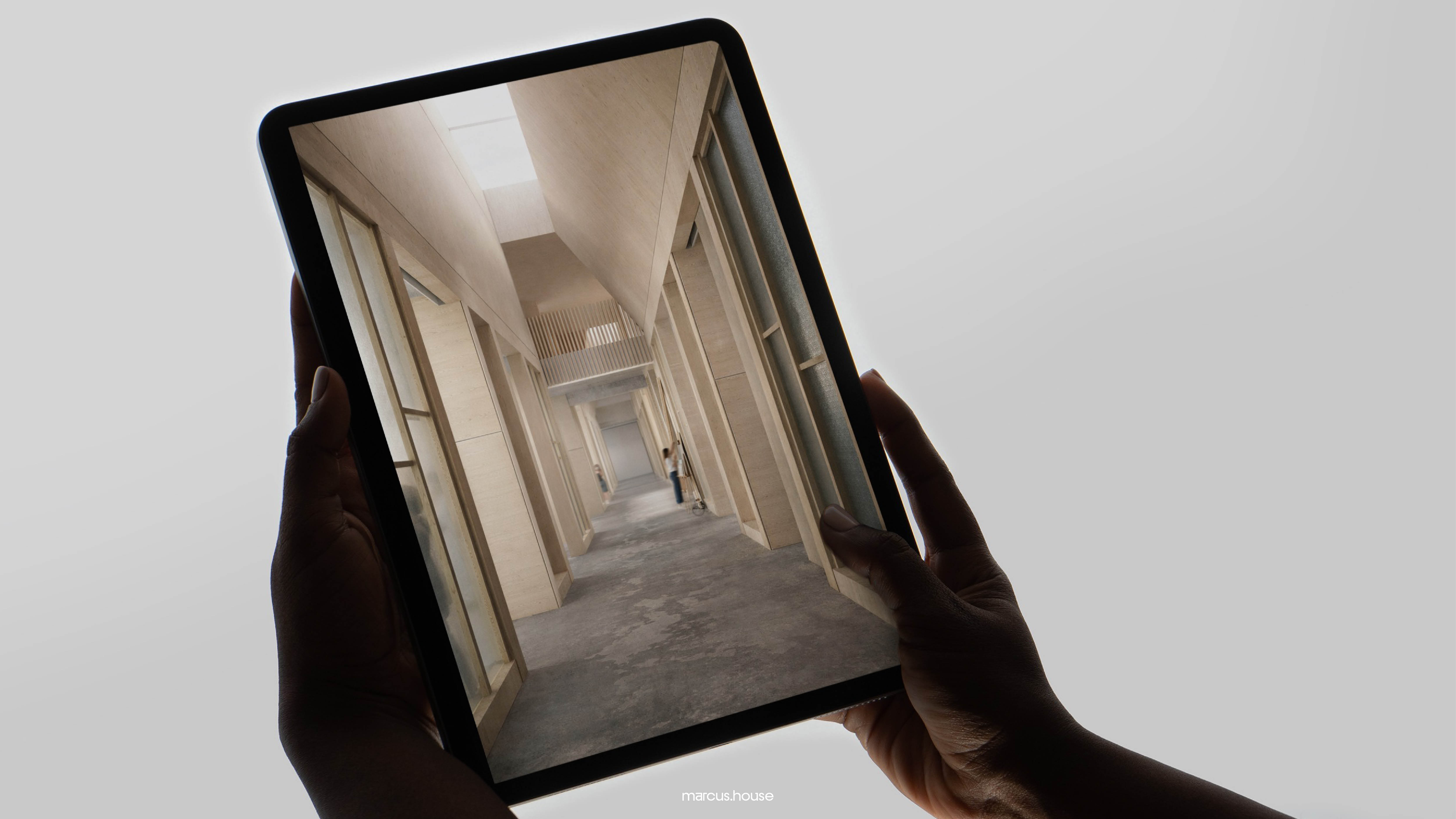
In architecture, circulation describes how people move through a building: where they enter, where they slow down, where they hesitate and which routes they take without being told. The corridor is only the means. Circulation is the behaviour it produces.
For this reason, a plan is drawn twice: once for what the building contains, and once for how it is moved through. The second drawing usually changes the first.
Most websites are built from the first drawing alone. Pages are mapped, a navigation bar is added to connect them, and the result is treated as a circulation strategy. But a menu is a list of destinations, not a route.
This matters because people rarely arrive where you expect. A visitor lands on a project page from a search, or on a Notes article someone has shared. The homepage, the front door everything was planned around, is often the last room they enter, if they enter it at all.
A threshold is the moment of transition from one condition to another: outside to inside, public to private, noise to quiet. Architects give thresholds particular attention because they set the expectation for everything that follows. A low, compressed entrance makes the room beyond it feel generous. The same room, reached through a wide hall, feels ordinary.
Most websites have no thresholds. Sections sit against one another at full width and equal weight, each asking for the same attention, so the visitor arrives everywhere at once and nothing has been prepared for.
The answer is rarely more design. More often it is restraint, placed just before the thing that matters: a pause, a narrowing, a stretch of quiet that gives the next moment its weight. Space is used to set up other space.
Sequence is the order in which things are encountered, and it is the part of a website most often left to chance.
On a studio’s website, the questions are practical. Does a visitor see the work before the philosophy, or after it? Does a project page end by sending them back to the index, or by offering the next project? Is the invitation to get in touch somewhere they have to find, or does it meet them at the point they’re most likely to want it?
No menu answers these questions. They are decisions about what follows what, and every page makes them, either deliberately or by default.
A useful test is to open any page on your website and ask what a visitor most plausibly wants next. Then check whether the page offers it, or offers a list of everything instead.
Movement only reads against stillness. A building that is all circulation becomes a corridor, and one that is all room becomes a warehouse. The design lies in the rhythm between the two.
Online, the pause is white space, used as structure rather than decoration. That means space placed deliberately, at chosen lengths, to set the pace of a page, rather than margin applied evenly for neatness.
A long stretch of space before a single line of text isn’t empty. It tells the reader that what follows was chosen, and that it’s worth slowing down for.
This is the hardest part to defend in a client meeting, because it can look as though something is missing. It reads as content taken away rather than intent added. The case for it is simple: without it, everything on the page is equally loud, and nothing is heard.
At the level of tools, very little. The same grid, the same components, the same CMS.
What changes is the order of the questions. Instead of asking which pages a website needs, we ask how someone will move through it, and what they will meet along the way. The sitemap comes second, and it comes out differently.
It also changes what survives a review. A section that seems to do nothing is often doing the most, and once you can name what it does, it stays.

